Shipment App
A friend of mine was applying for a UI/UX Designer position at a company I won’t disclose and was given a visual design test to create the UI for a fake shipment app within a week, based off of wireframes given to him. Since I needed more visual design work in my own portfolio, I thought this would be a great opportunity to tackle myself, so I asked if he would send me the PDF document containing the wireframes he was given. I also tasked myself to get this done within 5 days to stay true to the test.
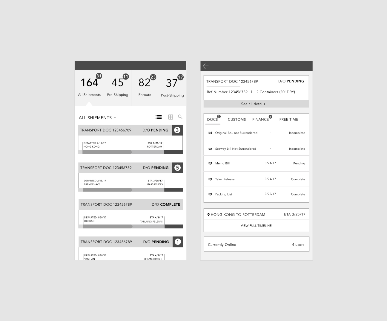
I did not create the initial wireframes, so I cannot speak to the thought process behind the organization of the information displayed, but I implemented UX methodologies going forward for the visual design portion of the application.
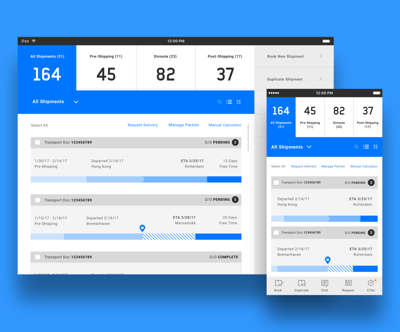
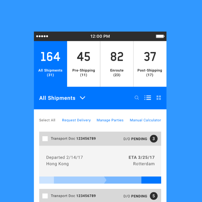
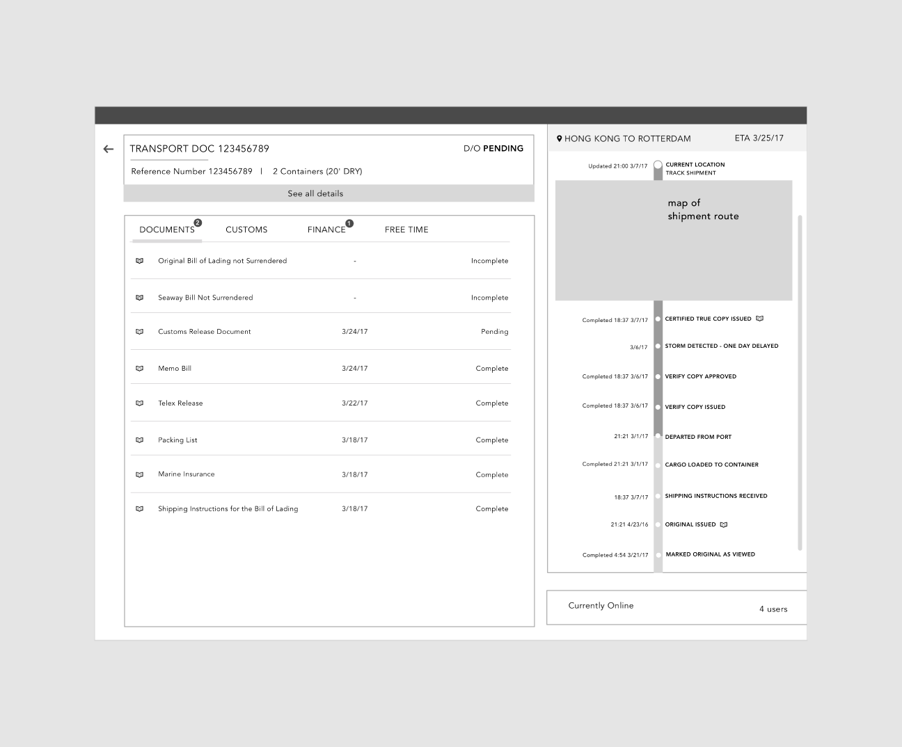
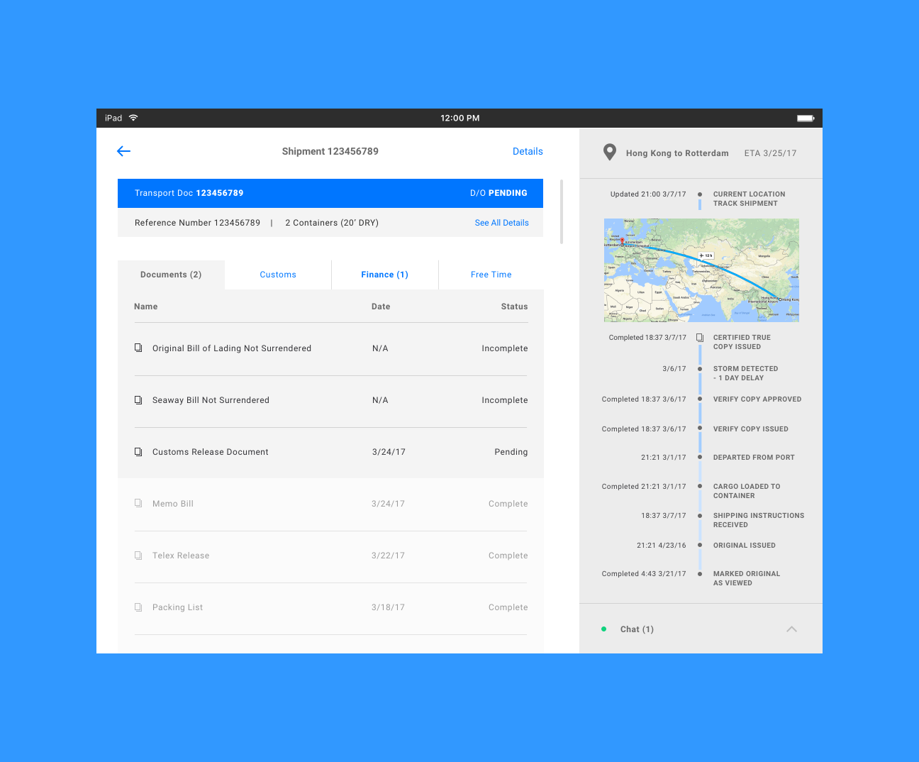
Being as this would be a highly functional shipment-tracking app based around a large amount of information, the design needed to reflect that and to stray away from flashy, over-the-top UI. I used the high functionality aspect of Material Design to influence the UI and focused on making sure the amount of content did not overwhelm the user by introducing the right amount of breathing room as well as a simple color palette, based around white with a few accent colors.
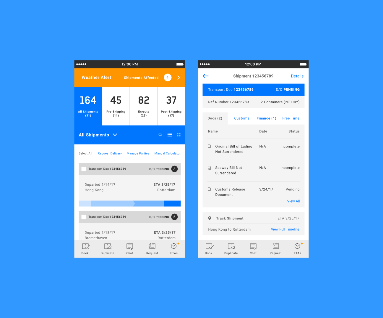
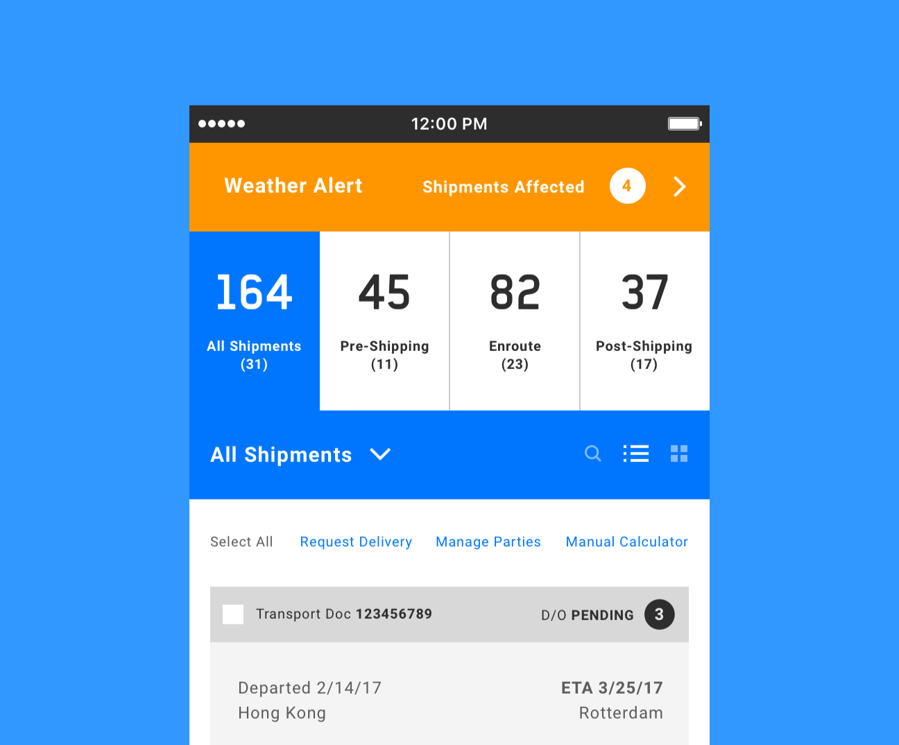
Since there weren’t branding guidelines to follow, the colors were up to me. Shades of grey along with a large amount of white keeps the focus on the information rather than aesthetics so users are not distracted. Blues are not only calming, but used in a succinct way to find clickable links or important information at a glance. The use of orange denotes critical information, such as here with Weather Alerts, which can affect the timing and ETA of a shipment.
Knowing that this app would most likely be used outside in addition to indoors, all of these elements use high contrast to make sure critical information stands out in the sunlight, reducing the effects of glare, but not so much so that the user’s eyes are fatigued.
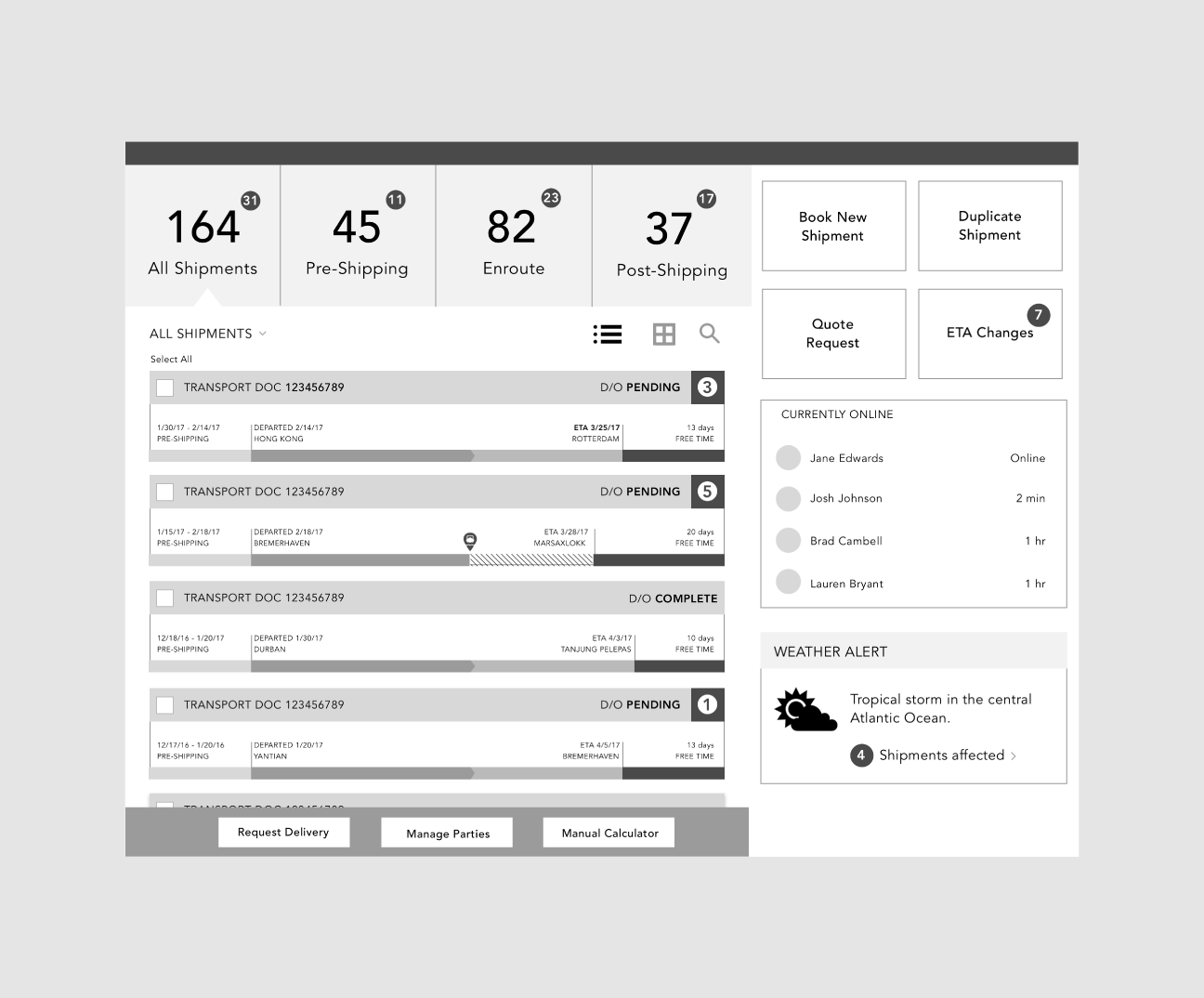
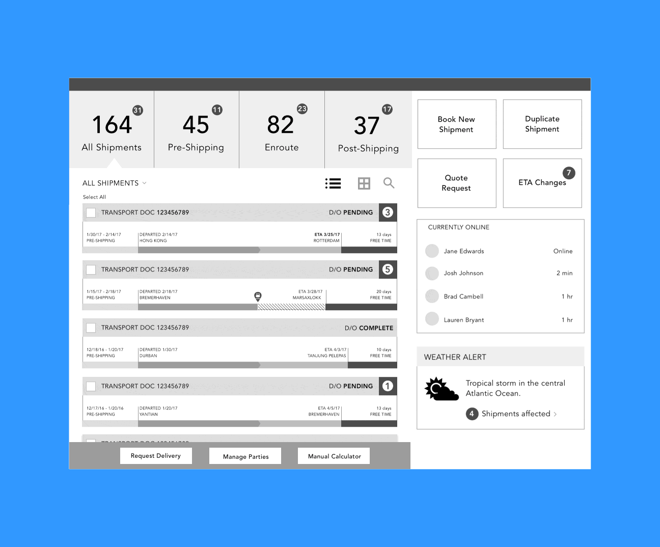
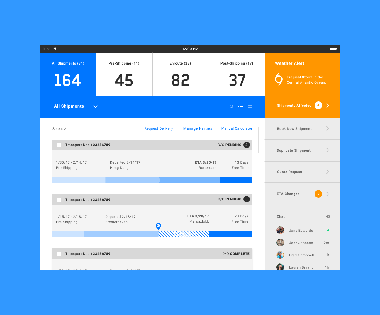
Using the grid helps to keep spacing and sizing uniform by using multiples of a row or column. This also helped to ensure elements would use the same sizing between phone and tablet, creating an overall cohesive experience. Various elements were also rearranged from the original wireframes to be able to create a more unified interface.
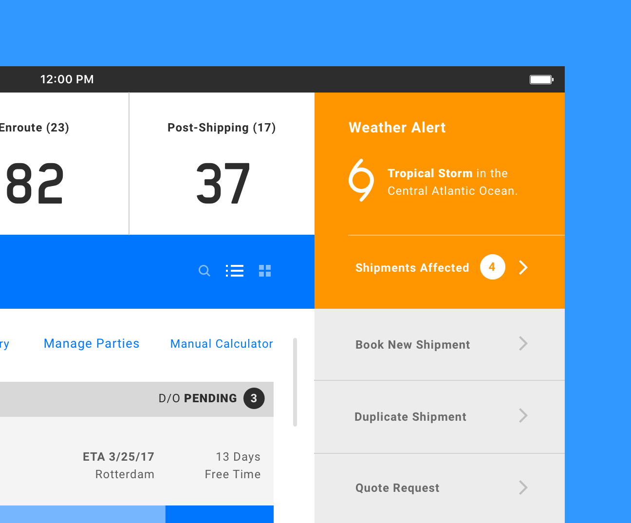
Weather Alerts are highly noticeable but make sure not to hide other information. A simple dive into the alert would provide more detailed information pertaining to which shipments are affected and by an estimated length of time. Alerts cannot be dismissed until information in question is reviewed. Once reviewed, the alert is dismissed and if the user needs to review the affected shipments again, they can check them in the “ETAs” tab.
This was a really fun task to take on as it was different than projects I had worked on before and was really in-depth as far as the amount of content. I would be interested to see how this project would fare with users had it been a real project and had I been creating the entire end-to-end user experience.