Letter Better
Product Design, Illustration
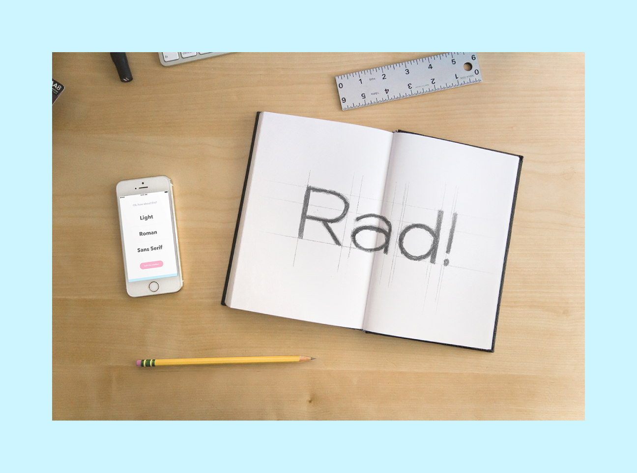
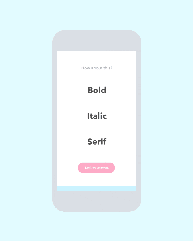
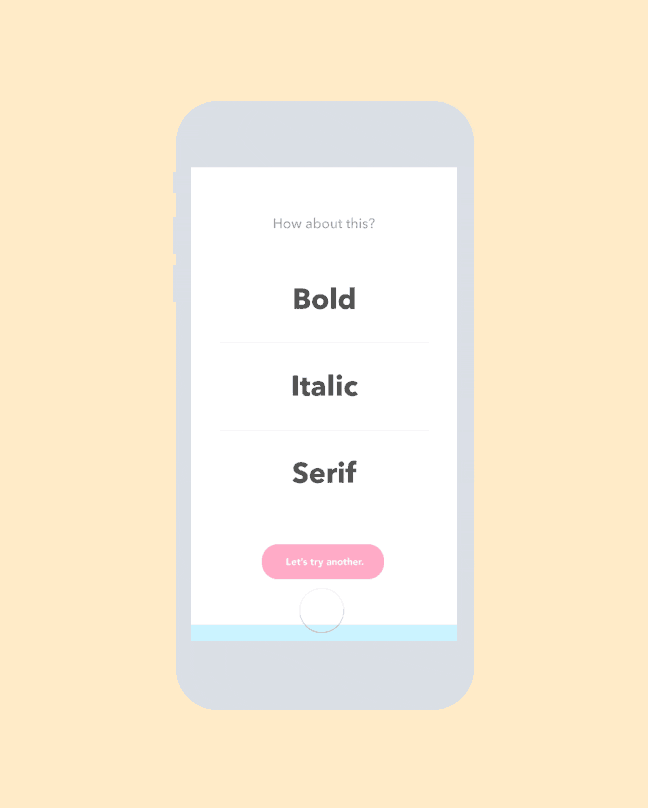
Letter Better is a very simple, ongoing conceptual app I came up with and designed to offer up randomly generated type parameters for practicing hand-lettering. You can use the app to either practice getting better at various styles or if you’re feeling stuck on a particular project and need ideas for type styles.
The problem Letter Better aims to solve (for lettering artists) is one we all know too well: blank canvas syndrome. Writers refer to this as writer’s block, but most people have felt some variation of this in their life. It’s a common question that comes up: “What should I draw?” or “What style should I letter this in?” There are infinite possibilities, but the aim of Letter Better is to alleviate the lettering process to get the artist quicker results, whether it’s practice or ideas for a project.
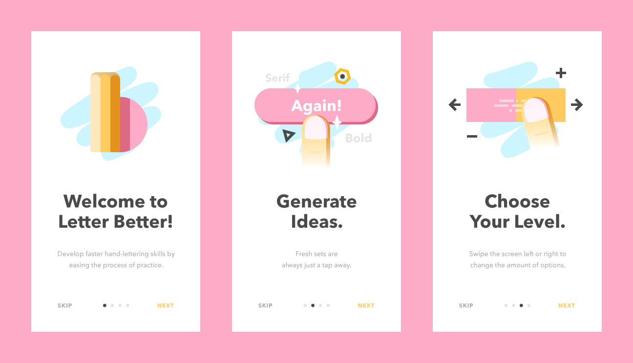
This app is intended to be very simple and do one thing and do it very well. In order to do that, onboarding screens needed to successfully walk the user through using the app. All the user needs to know is how to generate a new set of parameters and how to switch between the number of parameters given.
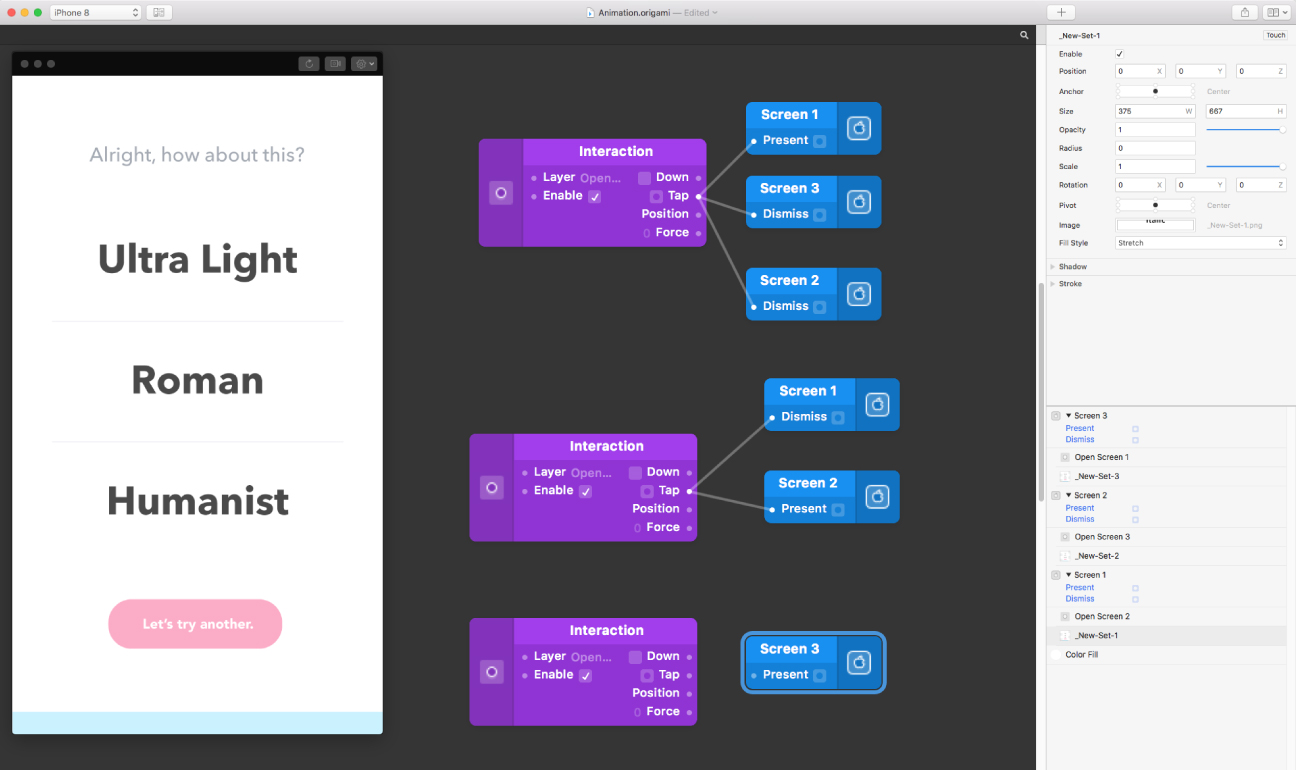
Swiping and tapping are such familiar and easy gestures that it became obvious to implement them to change difficulties and generate new type styles. I used Origami Studio to prototype and record these actions in use.
From here, I started moving on to how this app would best be conveyed through an icon on the user’s App Store or home screen. The challenge here was telling at a surface level what this app is about. We know that custom lettering, blank canvas syndrome, and a lot of trial and error make up most of the app’s main traits. We also know that the user loves typography.
Initially, I thought the upper and lowercase logo sketch referencing typeface style guides would best represent the functionality of the app.
However, after further exploration, it became clear that there was too much of a similarity to that of the Adobe application icons. After going back to the drawing board, the concept of using lettering tools as a lowercase L and B was discovered. At first, using a ruler to reference drawing guides and also a pencil seemed like the best choice, but ultimately the traditional pencil and eraser became the final direction.
Further iterations are currently being worked on, such as the ability to get a brief summary and example of a parameter if it is unknown to the user. This is an ongoing project that I am always looking to improve. If you’re a developer, I’d love to chat about getting a working version!